SAAS PLATFORM
Zeniva.ai SaaS App UX Redesign Case Study
COMPANY
Exarta Labs
ROLE
Sole Designer
EXPERTISE
UX/UI Design
YEAR
2024

Project description
Zeniva.ai is an AI-powered content creation tool focused on personalization and engagement. Built for Shopify stores, it allows users to generate smart audio and video content for product pages, promotions, and recommendations. Merchants can create content using AI, choose from a diverse library of avatars, record videos of themselves, or feature influencers to promote products and deliver personalized messages, all within a few clicks.
Timeline
From explorations to final designs in 5 Weeks while working with multiple projects at the same time
Background
While Zeniva offered strong features, it faced challenges converting users into paying customers. User feedback pointed to gaps in the journey, confusing flows, hidden features, and unclear CTAs, resulting in lower engagement and drop-offs.
Process
This category details the step-by-step approach taken during the project, including research, planning, design, development, testing, and optimization phases.
Research & Discovery
Identified key usability issues in the existing tool through user feedback and journey analysis. Studied similar tools like Heygen to benchmark best practices and drafted early concepts focused on clarity, speed, and accessibility for all user types.
User Flow & Information Architecture
Redesigned the user flow to streamline actions and reduce friction, ensuring it catered to both new and advanced users. Reworked the information architecture to better support new features and improve discoverability in existing ones.
Wireframing & Prototyping
Since the existing layout and color palette were retained, the focus remained on functionality and flow. High-fidelity screens were designed directly, followed by detailed prototyping to simulate real user interactions.
Testing & Iteration
Ran usability tests across internal teams and target users. Feedback was gathered and implemented through iterative design cycles, refining the experience until it felt seamless, intuitive, and user-friendly.

Problems Identified
Lengthy Onboarding Flow
The onboarding process consisted of five steps, which overwhelmed users early on and led to frustration before even reaching the product
Unclear Video Generation Steps
Two onboarding screens focused on video generation lacked context. A vague prompt like “Write welcome message” didn’t convey that it would auto-generate a live video for the store, confusing users and breaking trust.
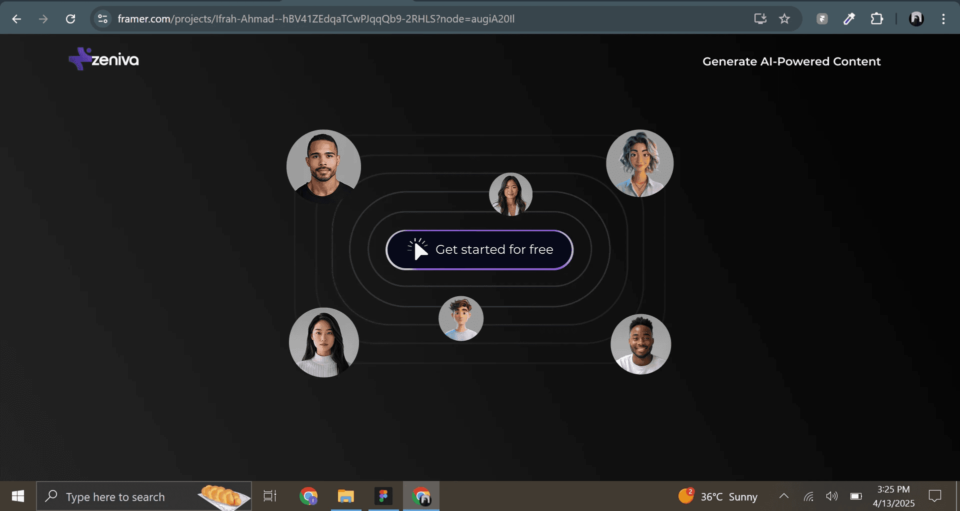
Disoriented Landing Post-Onboarding
After onboarding, users were dropped directly into the content creation screen instead of the home/dashboard. Without choosing the action themselves, users felt disoriented and unsure of what they were viewing.
Confusing Microcopy
Button labels, headings, and CTAs lacked clarity, often leading users to misinterpret actions or feel lost within the interface.
No Clear Starting Point
The content creation screen offered no clear CTA or visual hierarchy to guide users on how to begin generating content.
Misleading UI Behavior
Generated content appeared editable due to its design, but wasn’t causing users to repeatedly click and grow frustrated when no edits occurred.
Lack of Activation Guidance
Content wouldn’t appear on the store until the plugin was enabled, but users received no warning or onboarding message about this critical step, leading to confusion and perceived failure.
Solutions Implemented
Streamlined Onboarding
Reduced the onboarding flow from five steps to three, focusing only on essential actions to keep the experience lightweight and user-friendly.
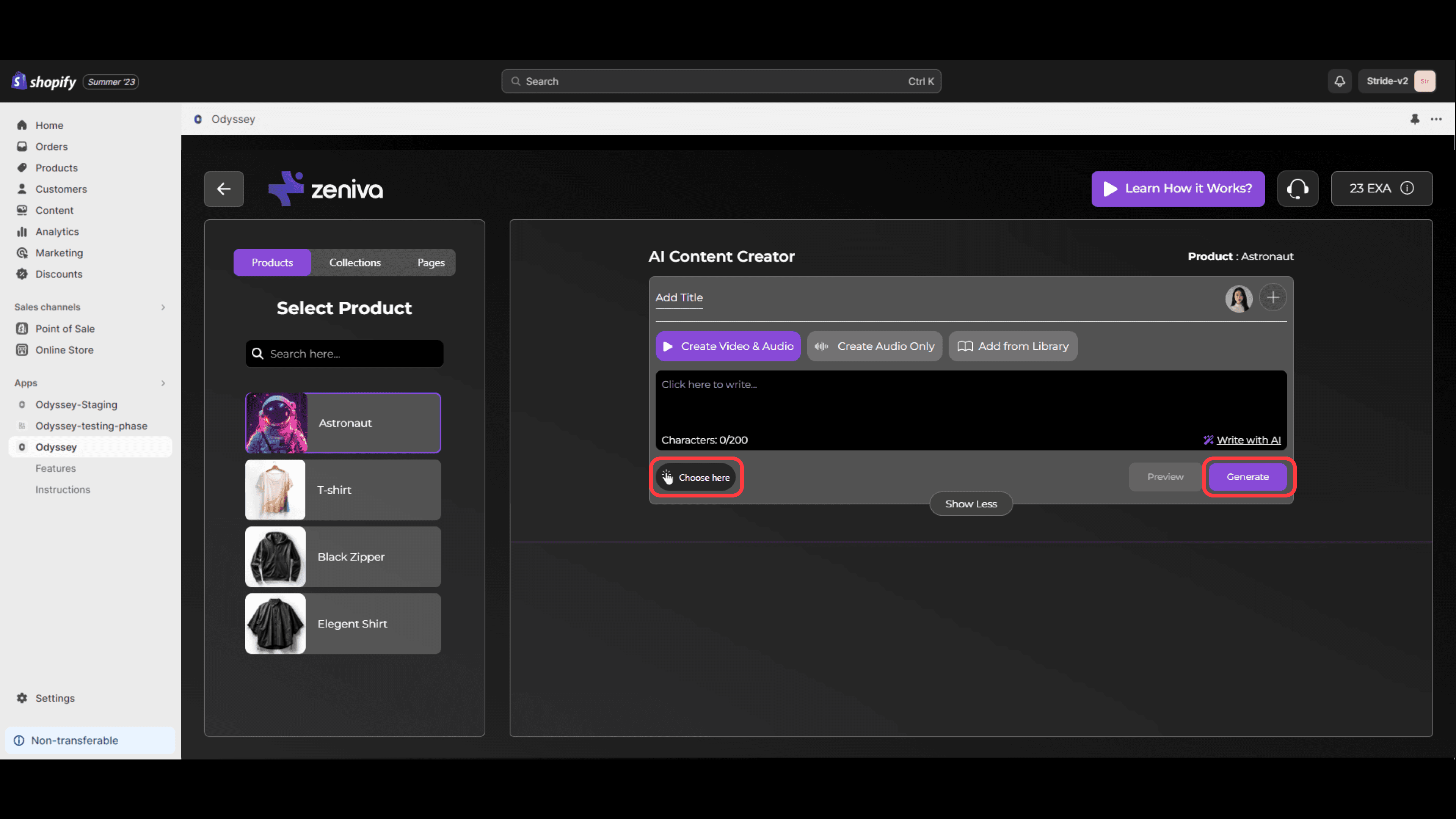
Removed Video Creation from Onboarding
Eliminated the auto video-generation step from onboarding. Instead, introduced a dedicated feature later in the journey, giving users full control and clarity.
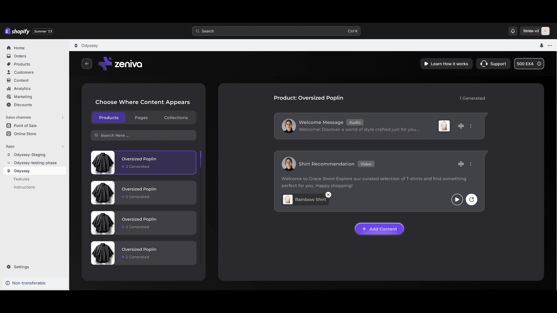
Added Visual Cues for Features
Integrated icons and micro-interactions to better explain each feature, helping users understand functionality at a glance.
Refined UX Copywriting
Rewrote all buttons, headings, and CTAs with a UX writing approach, using clear, action-oriented language to guide users intuitively.
Introduced Informational & Warning Pop-ups
Added helpful pop-ups to inform users about important actions (e.g., turning on the plugin to display content) and prevent confusion or missed steps.
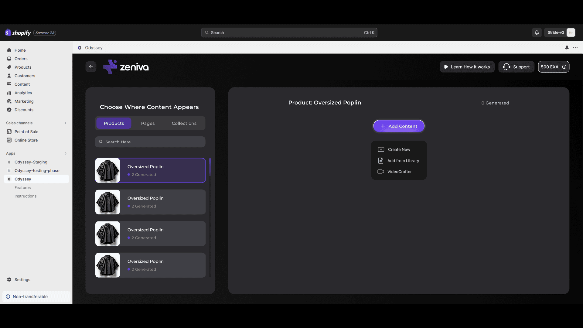
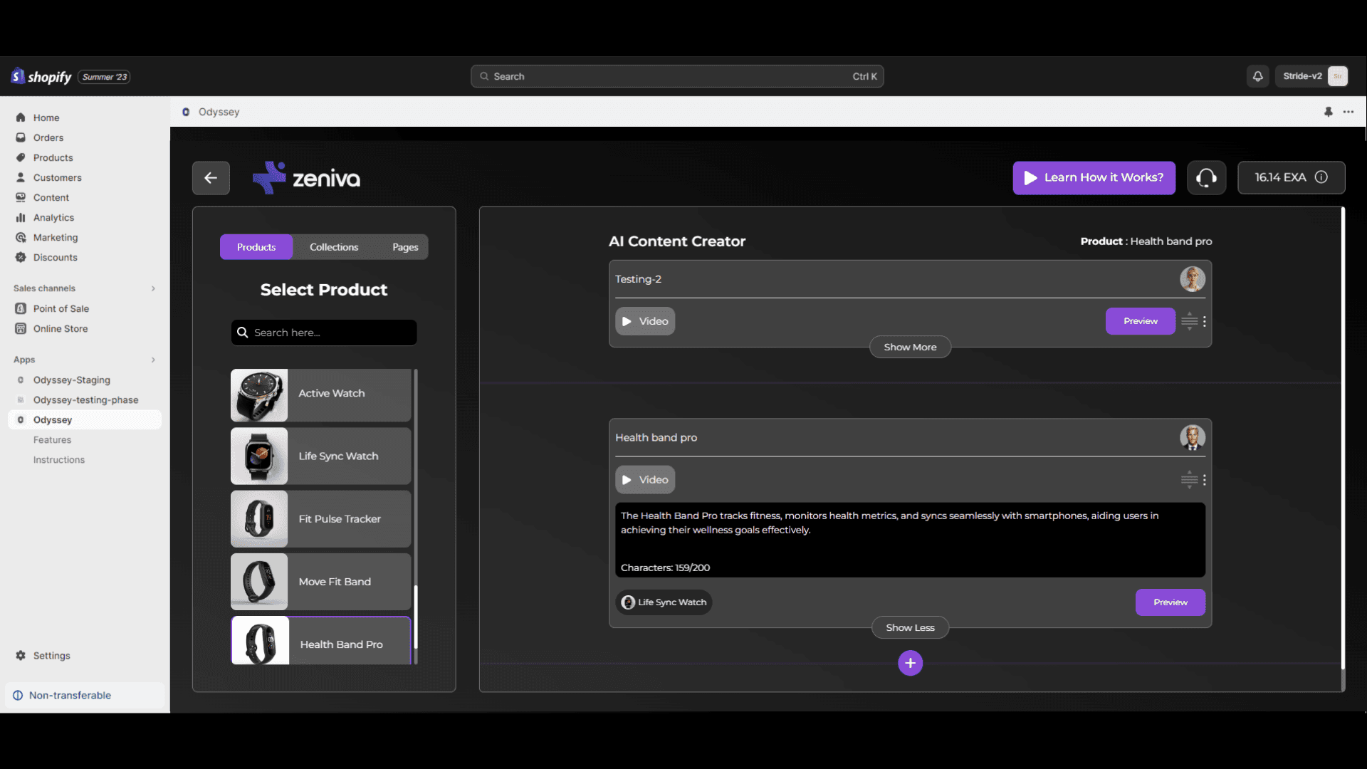
Introduced “Video Crafter” as a Dedicated Feature
Launched a new feature called Video Crafter, making video generation a conscious, user-initiated action rather than something that happens passively.
Updated Post-Onboarding Landing
Redirected users to a clean and structured home/dashboard after onboarding, allowing them to choose their next steps and better understand the platform.
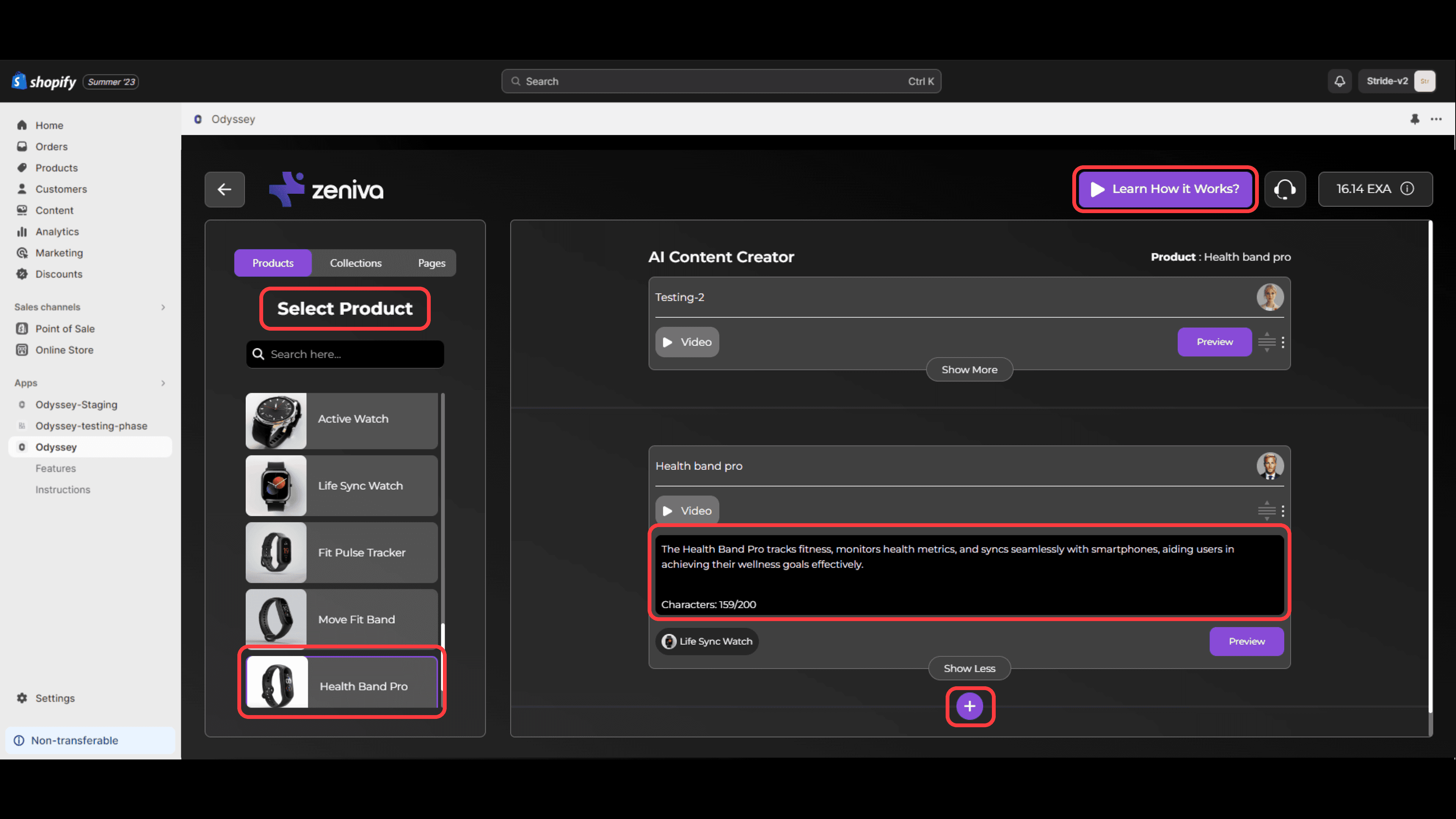
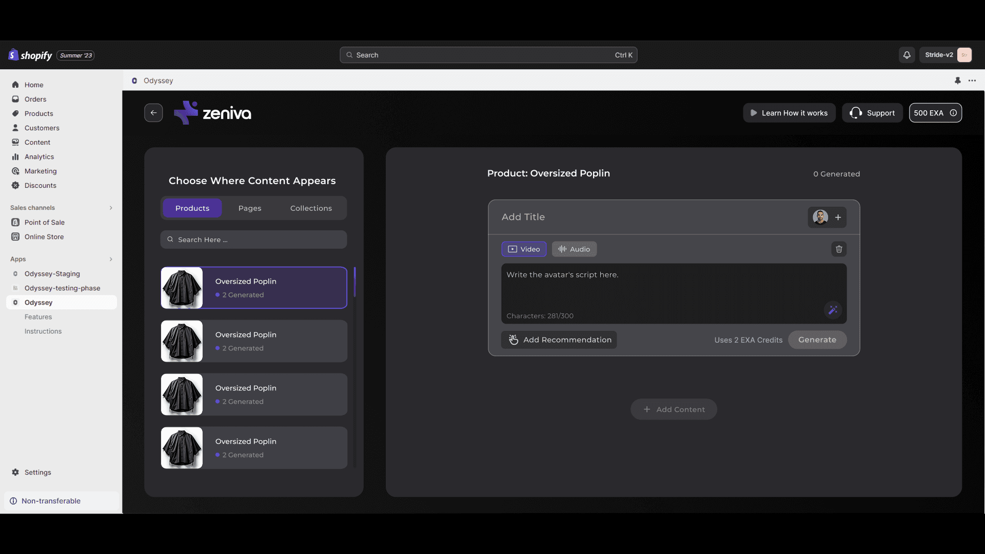
Clear Starting Point in Content Creation Screen
Redesigned the content creation page with a strong visual hierarchy and a prominent CTA so users immediately know where to begin.
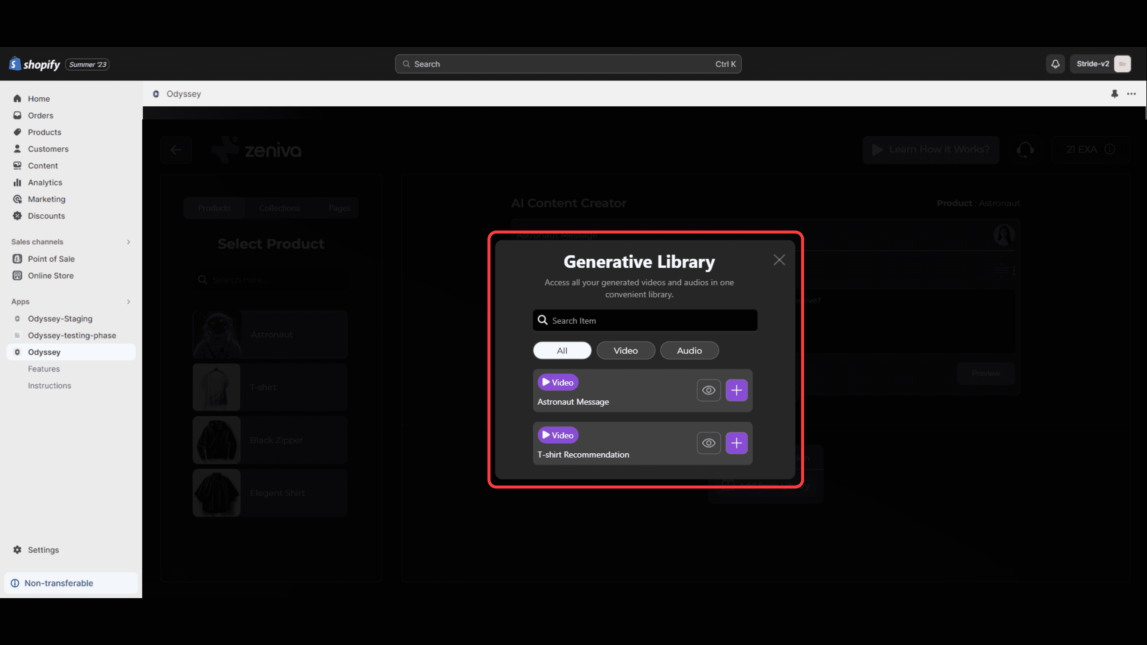
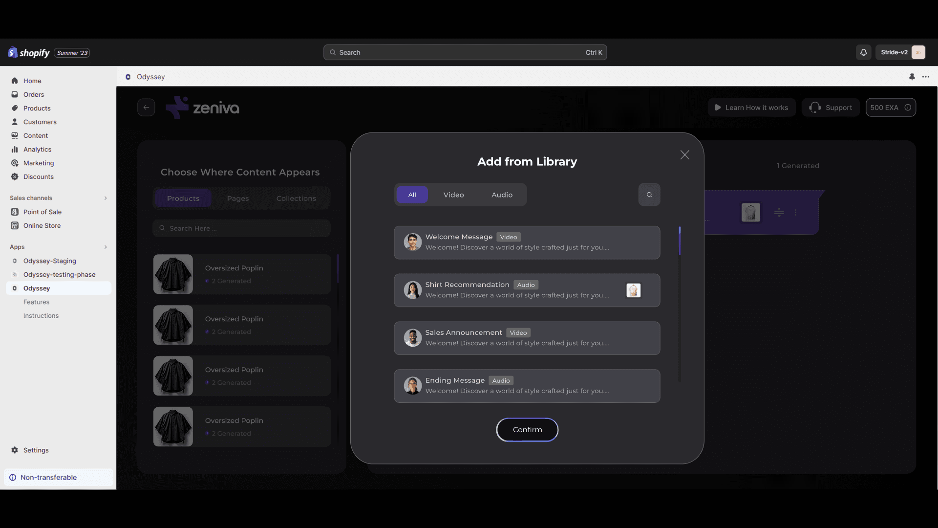
Improved UI Feedback for Non-editable Elements
Updated the design of generated content to clearly distinguish editable vs. static areas, reducing user confusion and unnecessary interactions.

Results
Positive Internal Feedback
Team testing sessions reported significant improvements in clarity, usability, and user flow. Onboarding was described as smoother, and feature discovery felt more intuitive.
Improved User Understanding (via Testing)
Early user testing with select participants showed increased confidence in navigating the platform. Users clearly understood where to start and how to generate content without external guidance.
Ready for Launch Validation
With major UX issues addressed and early testing showing promising results, the new version is now in final review, ready to go live with a stronger, user-centered experience.