SAAS PLATFORM
Odyssey3d Forge SaaS App UX/UI Case Study
COMPANY
Exarta Labs
ROLE
Sole Designer
EXPERTISE
UX/UI Design
YEAR
2024


Project description
Odyssey3D is a Shopify-based platform that enables users to create and customize 3D stores. Users can add 3D models, characters, text, products, frames, and edit store themes and colors. The platform also offers AI-generated models and textures, VR mode, and a variety of other features for a fully immersive shopping experience
Timeline
From explorations to final designs in 2 Months while working with multiple projects at the same time
Background
Odyssey3D initially offered a Free Plan with a simple UI tailored to limited features. As we transitioned to the more advanced Forge Plan, the existing UI could no longer support the added complexity, resulting in user confusion and navigation issues. We needed a redesigned UI for both plans that would be scalable, intuitive, and easy to navigate for all users, especially those without technical backgrounds.
Process
This category details the step-by-step approach taken during the project, including research, planning, design, development, testing, and optimization phases.
Research & Discovery
Identified pain points in the existing editor and analyzed user frustrations. Studied similar 3D platforms like Spline, Womp, and Adobe Project Neo. Created initial drafts focused on simplicity and accessibility for all user types.
User Flow & Information Architecture
Redesigned user flow and restructured information layout. Took inspiration from intuitive tools like Figma, Framer, and Canva to ensure a seamless and familiar experience.
Wireframing & Prototyping
Built low-fidelity wireframes, selected a clean and cohesive color palette, and developed interactive prototypes covering all key features and actions.
Testing & Iteration
Conducted multiple rounds of testing with both internal and external users. Collected feedback, refined designs, and iterated until the experience was intuitive and friction-free.


Problems Identified
Invisible Models on Add
When a model was added to the scene, it didn’t appear visually until the user manually selected it from the model list and clicked on the scene, disrupting the flow.
Inconsistent Frame Behavior
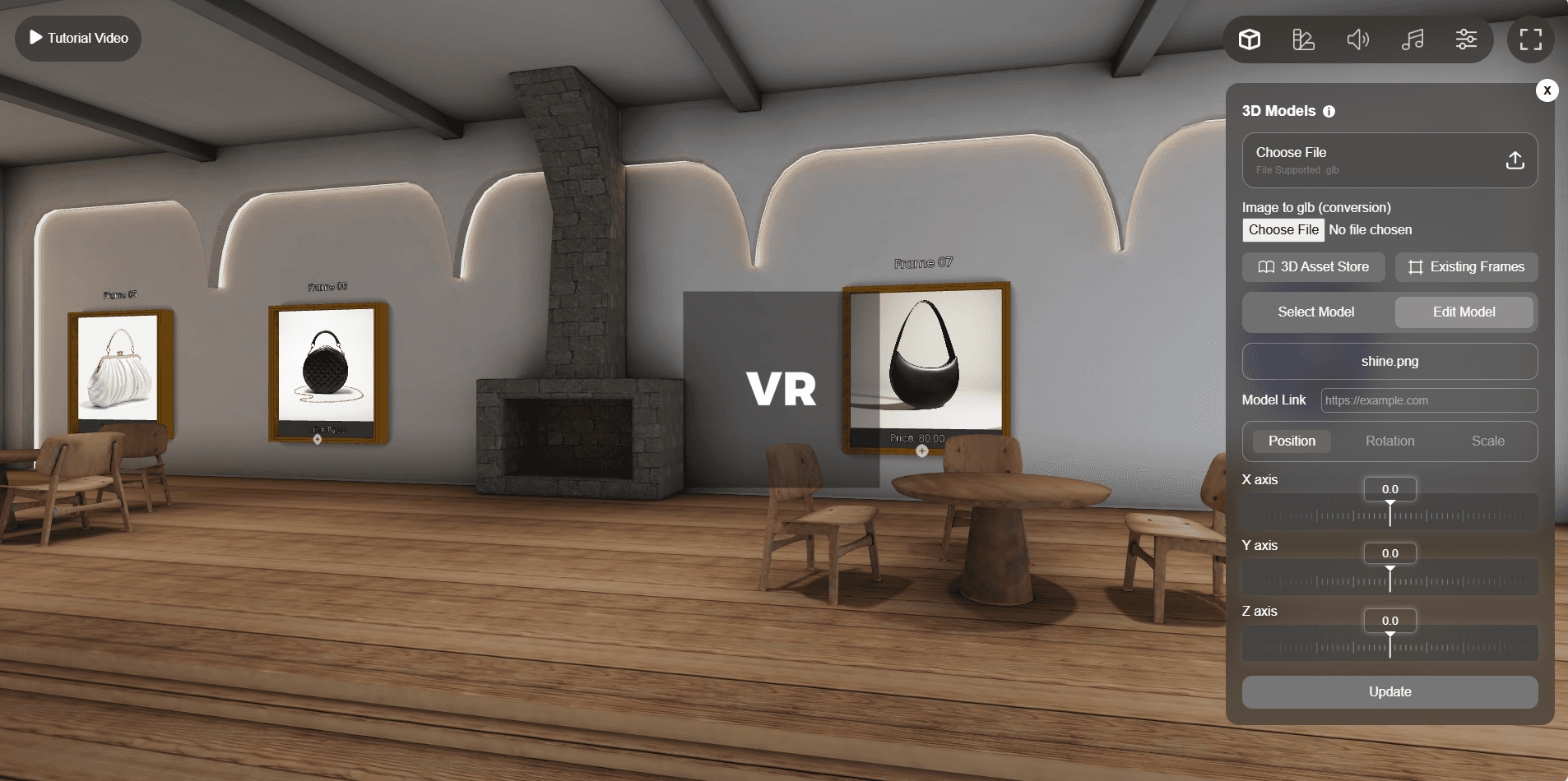
Frames were treated as 3D models, despite offering advanced features like image/video embedding. These unique features were deeply buried and inconsistent with model interactions.
No Object Visibility or Layers Panel
Users couldn’t view or manage existing scene elements like frames or walls. They had to manually click through each object to see if it was interactive.
Confusing Panel Structure
The same card UI was used for both the editing panel and the model list, making it unclear what actions could be taken, leading to cognitive overload.
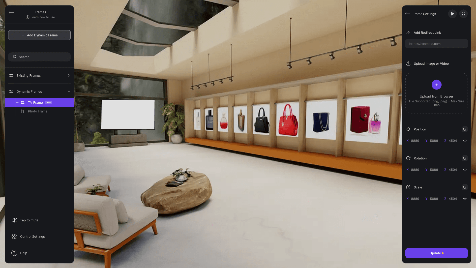
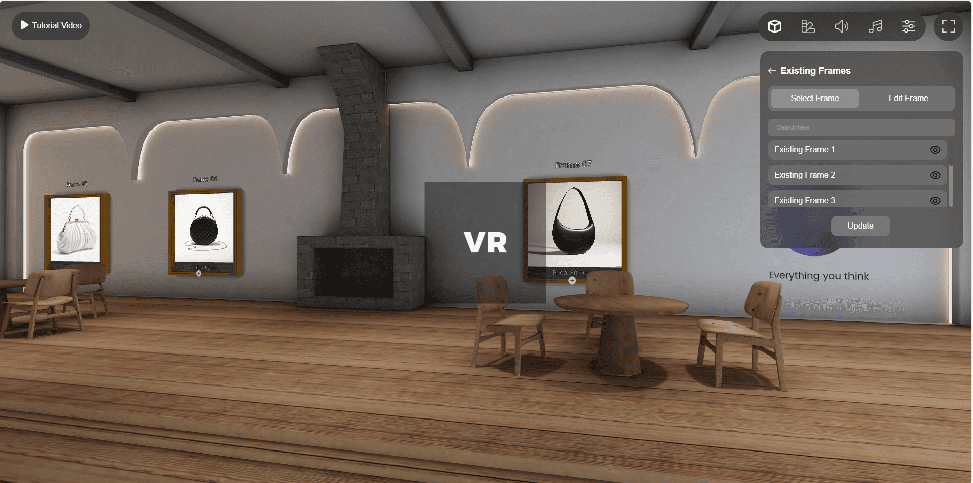
Dynamic vs. Existing Frames Confusion
The platform offered two types of frames: Existing Frames, which allowed only scaling, and Dynamic Frames, which supported images, videos, positioning, rotation, and scaling. While existing frames were easily accessible in the model panel, dynamic frames were hidden without clear labelling, buried deep in the 3D model library, making them nearly impossible for users to discover or differentiate
Solutions Implemented
The resulting Odyssey3D platform delivers a seamless user experience, empowering individuals and businesses to effortlessly create, customize, and manage immersive 3D storefronts.
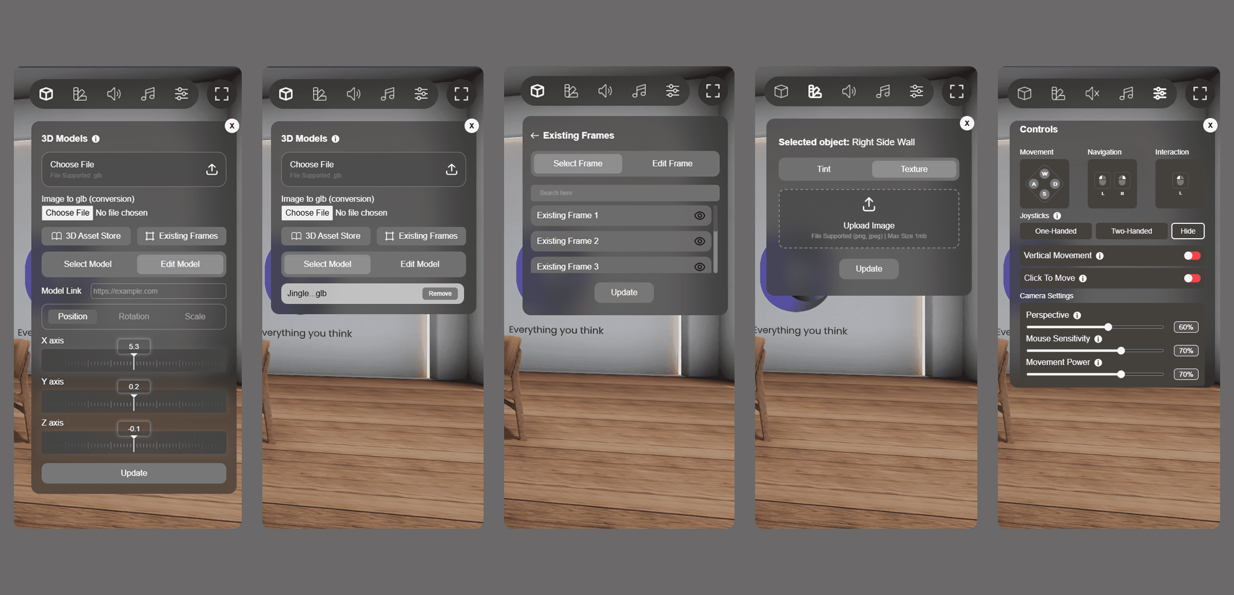
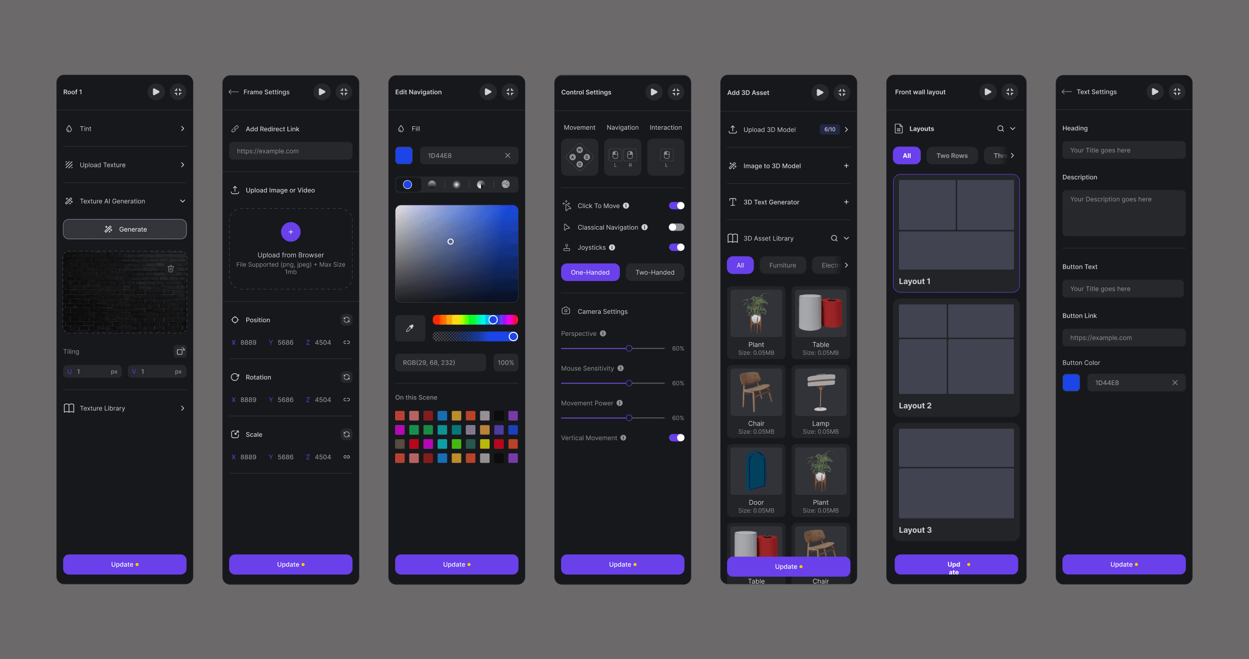
Separation of Features
3D models, frames, and the Interior Studio were separated into distinct modules, each with its own layers and editing panel for clarity and control.
Dual-Panel Layout
Introduced a two-panel system: the left panel for layers/navigation and the right panel for editing, reducing clutter and improving focus.
Structured Interior Layers
Walls, floors, and objects in the Interior Studio were categorized in the layers panel, allowing users to select elements directly from the list or the scene.
Consistent Architecture & Naming
Standardized naming conventions and UI structure across the platform, replacing the previously random placement with a consistent, intuitive flow.
Upload Limit Visibility
Added clear upload limits upfront and replaced the abrupt pop-up with a smarter alert system that informs users early in the process.
Scale Pinning Option
Introduced a pin toggle during object scaling and positioning to maintain proportions and prevent distorted dimensions.
Update Store CTA
Added a clear call-to-action to update the store after edits, along with a reminder pop-up if users try to exit without saving changes.
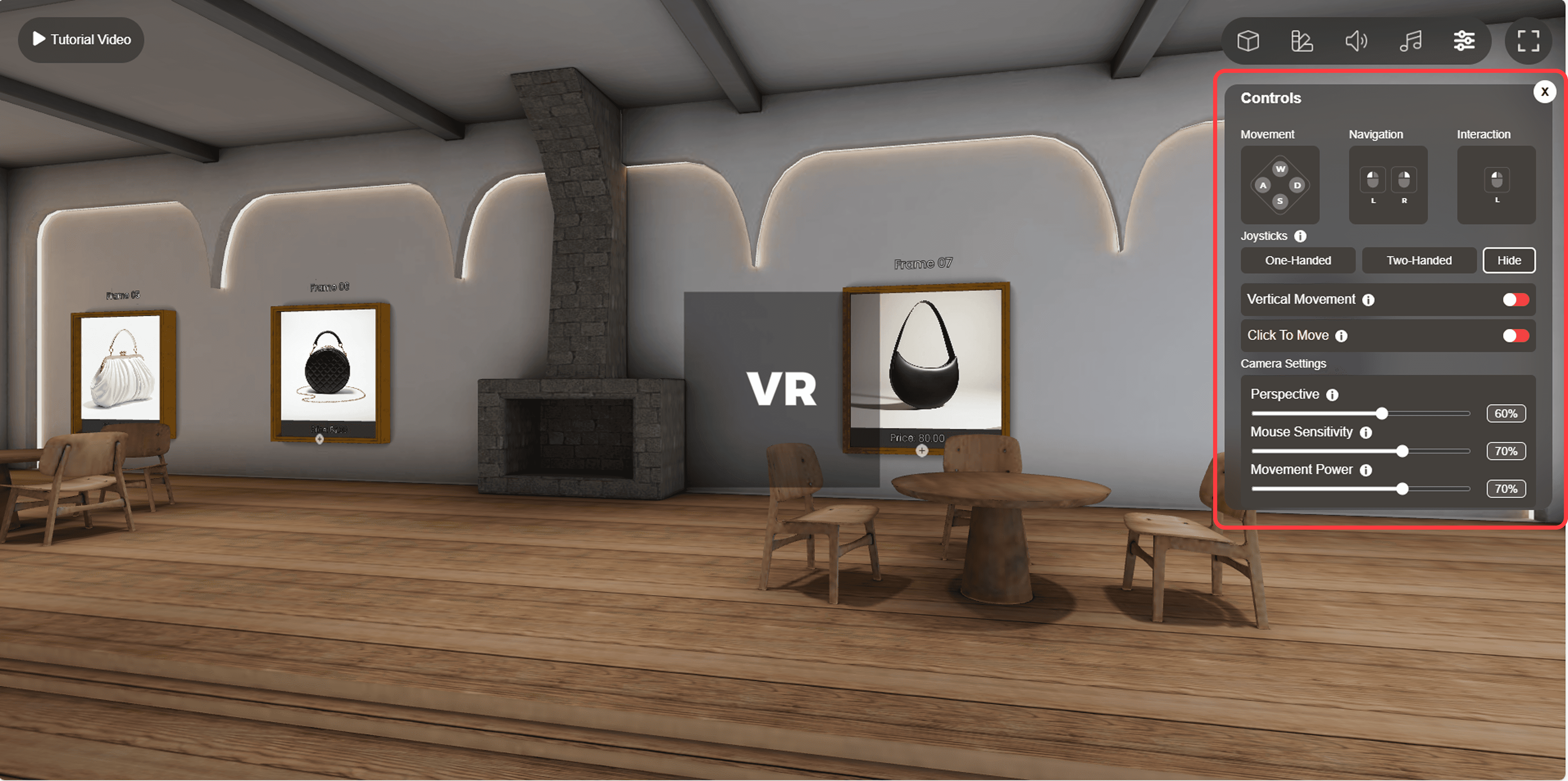
Onboarding Product Tours
Launched guided product tours for every major feature — helping new users get started quickly without external help.
Feature Expansion
Integrated advanced features like a 3D text generator, AI model generator, customizable 3D characters, profile card design tools, and optimization status indicators.

Results
Here, the outcomes and achievements of the project are highlighted, including user feedback, adoption rates, and industry recognition.
Increased Efficiency
Users experienced noticeable time savings during store creation. Streamlined workflows, structured layers, and simplified editing led to faster execution and reduced friction.
Improved Productivity
Optimized design and feature accessibility allowed users to focus more on creativity than troubleshooting. Smart defaults and automation (e.g., AI model generator, scaling pins) reduced repetitive tasks.)
Positive User Feedback
Feedback highlighted how intuitive and beginner-friendly the new interface felt. New users especially appreciated the guided tours, while experienced users praised the consistency and flexibility of the layout.